ROLE
Lead UX Designer
TIMELINE
6 months
TYPE
Product Design
My Role
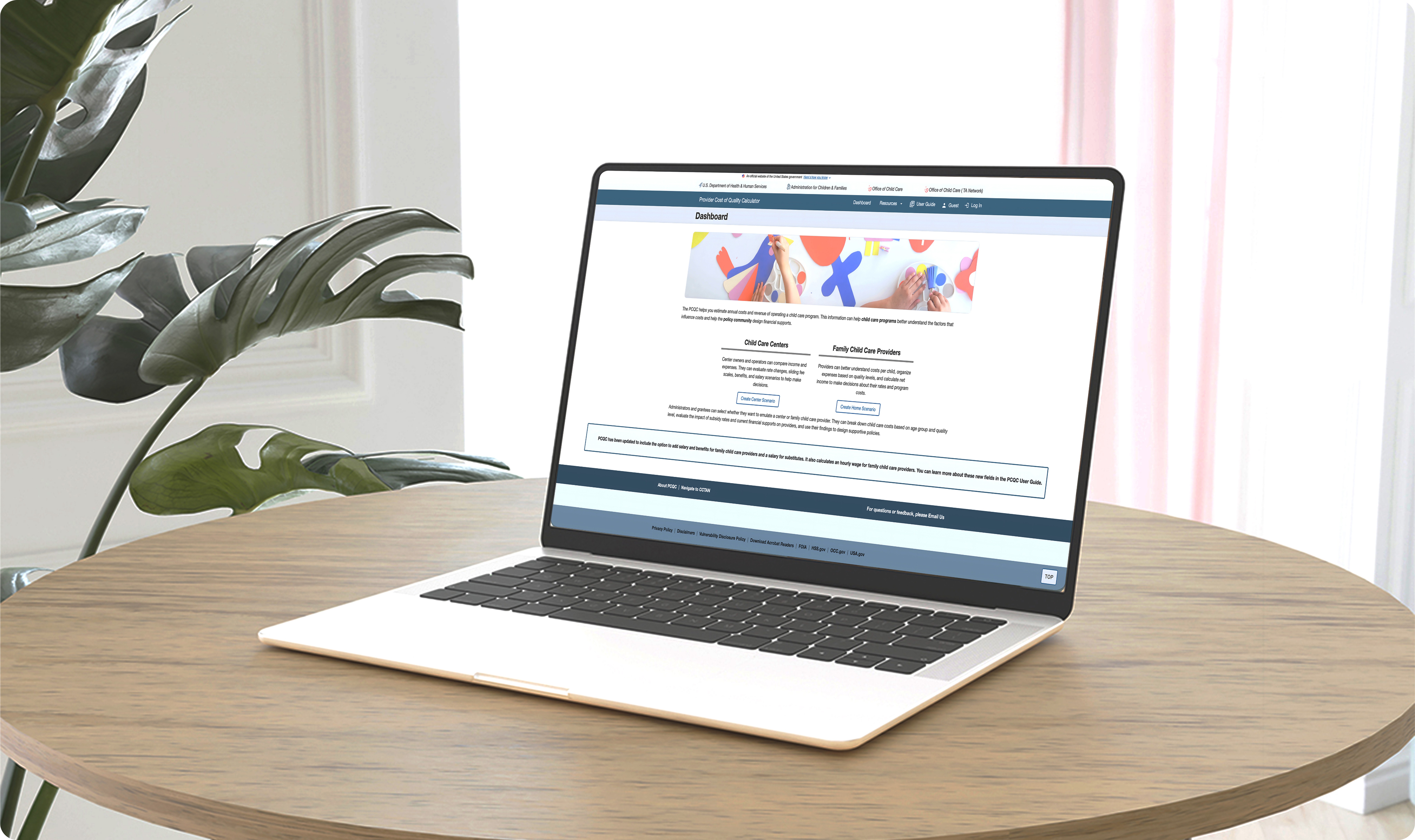
I led the redesign of the Provider Cost of Quality Calculator (PCQC), focusing on improving user orientation, reducing cognitive load, and creating a more guided completion experience. Working closely with product managers, developers, and subject matter experts, I translated complex financial workflows into a clearer, more intuitive experience that helped childcare providers estimate operational costs with greater confidence.
Conducted UX evaluations to identify usability issues and workflow friction
Defined the design strategy for simplifying complex financial calculations
Designed wireframes, interaction flows, and high-fidelity prototypes
Supported development by validating designs and refining the experience through iterative feedback
The Challenge
Childcare providers struggled to estimate the true cost of care due to fragmented workflows, unclear terminology, and limited visibility into how inputs affected calculations.
Unclear Starting Point
Users weren't sure where to begin
or what information they needed
to gather.
Complex Calculations
Technical terminology and financial formulas created barriers for less experienced providers.
State pages lacked hierarchy
Users couldn't easily tell where they were in the process or how much remained.
Difficult to Interpret Results
Financial outputs were separated from data entry, forcing users to constantly switch contexts.
Design Process
A user-centered approach to solving the right problems.
Discover
Define
Design
Created wireframes, interaction patterns, and visual concepts focused on clarity and guidance.
Validate
Refined solutions through stakeholder feedback and iterative usability reviews.
Research Findings
To better understand the experience and journey of a user attempting to gain childcare expense information, I reviewed the legacy system and findings from a heuristic evaluation performed by another team.
Four key areas emerged that were creating friction for users.
1
Confusing Login Experience
The purpose of the site wasn't clear at a glance. Important actions like signing in or creating an account were buried between lengthy text and disclaimers, which could confuse users and discourage them from continuing on.

2
Registration Created Friction
The only way to access the calculator was through registration. Users had to provide extensive details upfront, which created an unnecessary barrier—especially for those who just wanted to try the tool or create a quick scenario.

3
Disconnected Scenario Creation
Users could create two types of scenarios—Child Care Centers and Family Child Care Providers—but the experience didn't clearly communicate the difference or guide users to the right path. Navigation between options was unclear and lacked direction.

4
Calculations Were Hidden
Users had to constantly switch between the page they were working on and a separate "Calculations" page to see results. This back-and-forth disrupted their workflow and made it harder to understand how inputs impacted outcomes in real time.

Key Takeaway
The legacy experience lacked clarity, surfaced information too late, and created unnecessary barriers - making an already complex tool even harder to use.
Exploring Solutions
Research helped identify where users were experiencing friction, but wireframing allowed us to explore how those problems could be solved. Early concepts focused on simplifying complex workflows, improving navigation, and making financial information more accessible throughout the experience.
Rather than committing to a single direction, we explored multiple interaction patterns, tested assumptions with stakeholders, and iterated quickly before moving into high-fidelity design. This process ensured every design decision was grounded in user needs rather than visual preference.
Below are a few examples of the design concepts.


The Final Experience
The redesigned PCQC experience simplifies complex workflows, surfaces calculations in context, and empowers providers a make informed financial decisions with confidence.
1
Reimagining the entry experience
We explored ways to clearly communicate the value of the tool and allow users to gt started without the barrier of creating an account.
Design Decisions
Clear value proposition above the fold
Guest access to explore the tool
Prominent primary actions
Trust indicators and simplified layout
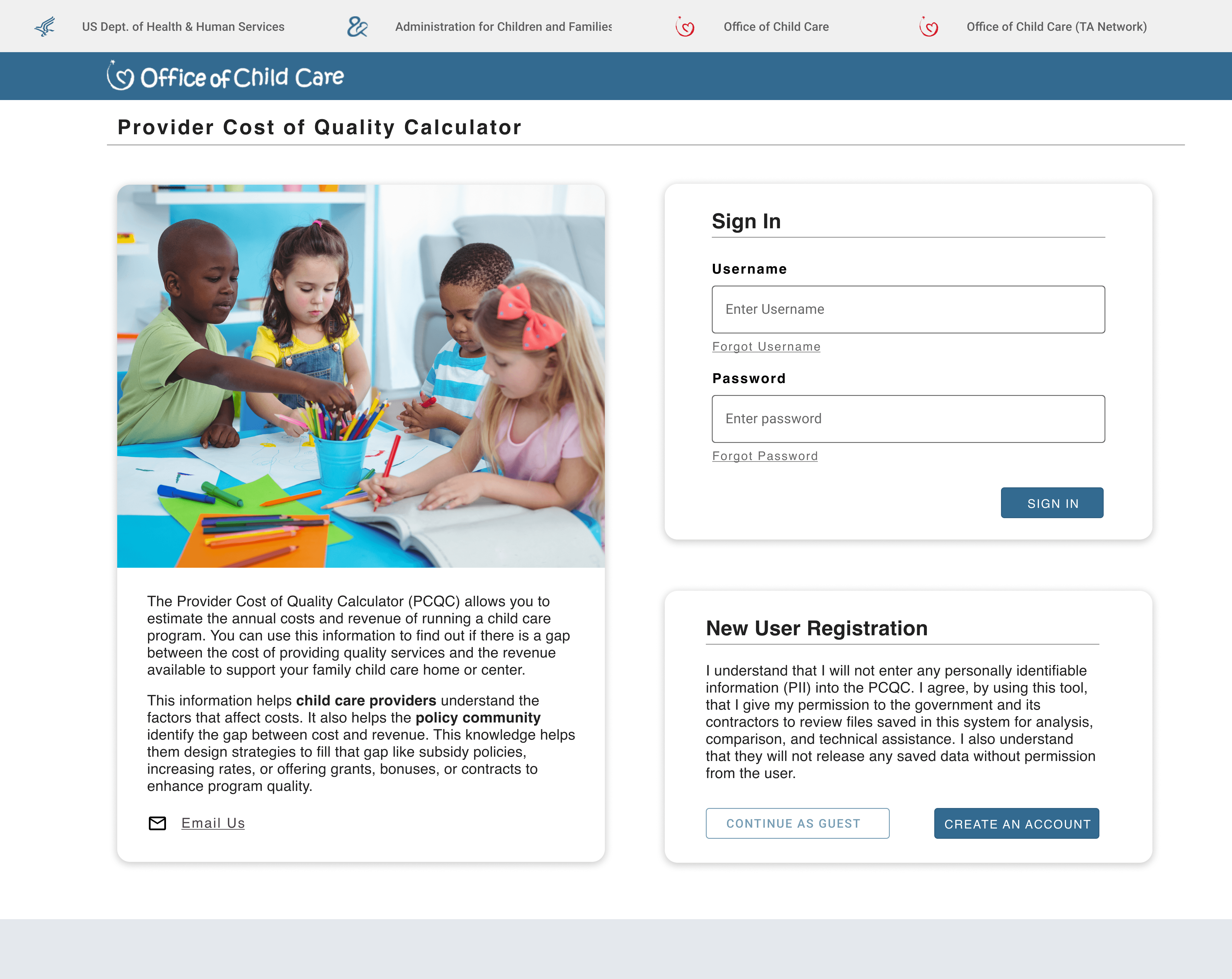
Entry experience UI showing sign-in and account creation pathways
2
Creating clear scenario paths
We tested a dashboard layout that makes the two scenario types easy to understand and choose, with guidance and resources close by.
Design Decisions
Two distinct pathway cards
Helpful resources in the navigation
Consistent pattern across the tool
Clear, task-focused language

Dashboard view shows two scenarios that users can use to begin their journey
3
Bringing calculations into context
We explored persistent calculations summaries that updated in real time - keeping results in view so users can understand the impact of their inputs as they go.
Design Decisions
Persistent summary panel
Toggle between Baseline and Quality levels
Real-time updates after each save
Reduced context switching

An example of a home scenario with expenses shown on the right-hand side
KEY TAKEAWAYS
PCQC reinforced key lessons about designing complex tool, balancing user needs
and working within real-world constraints.
01
Simplyfing Complexity
PCQC reinforced that designing complex tools isn’t about adding more guidance everywhere—it’s about knowing what to simplify, what to surface, and what to keep in the background so users can stay focused on their goals.
02
Designing for Confidence
A core part of the redesign was helping providers feel more oriented and in control throughout the experience. That meant reducing ambiguity, clarifying workflows, and presenting calculations and results in ways that felt more transparent and actionable.
03
Modernizing within Constraints
Because PCQC was a legacy product, the work required balancing meaningful UX improvements with technical and organizational realities. The project strengthened my ability to make pragmatic design decisions that improved the experience.